Designing the sign-up form
Configure the storefront sign-up experience without changing theme code. Test the result on an out-of-stock product after saving each change.
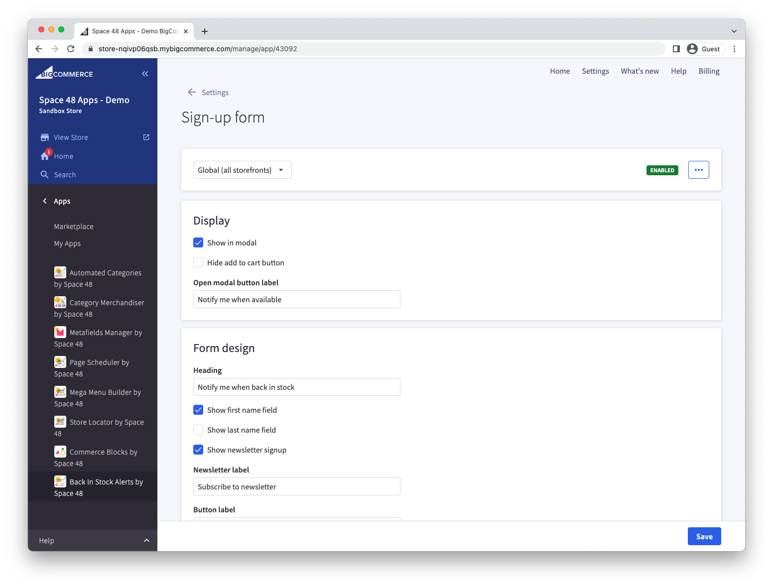
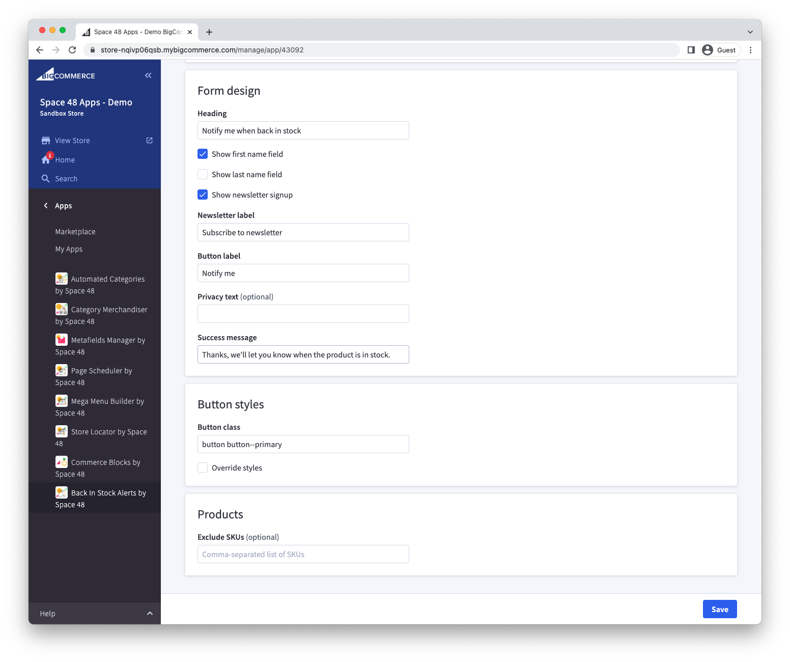
The settings page is organised into Display, Form design, Button styles and Products panels. Save after changing a panel, then test an out-of-stock product on your storefront.
Enable alert requests
Open the sign-up form settings, open the … menu and enable the form.
Choose modal or inline display
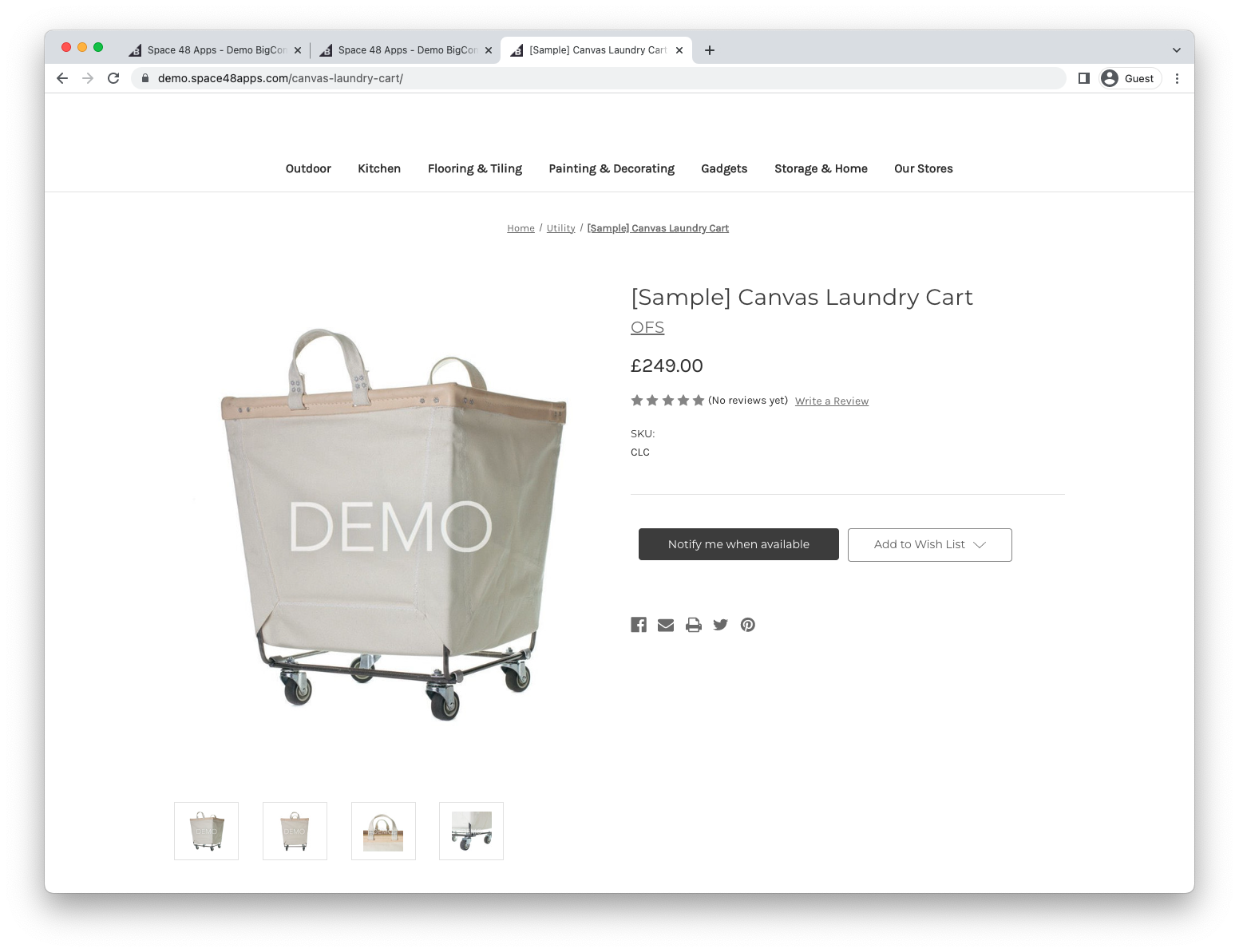
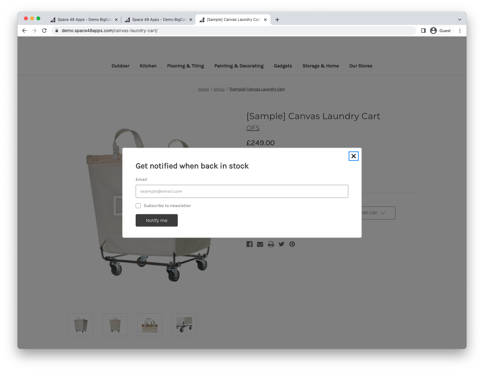
Enable the modal option to show a Notify me when available button on out-of-stock products. Selecting the button opens the sign-up form in a dialog.
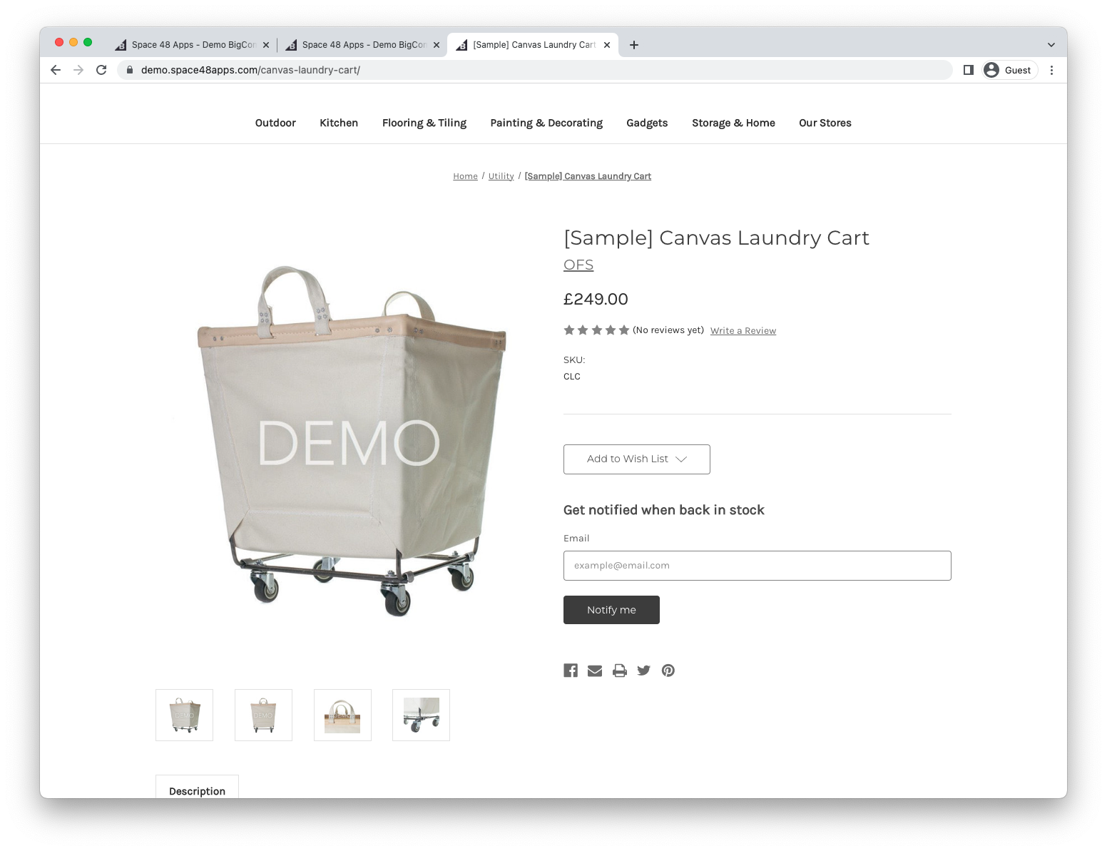
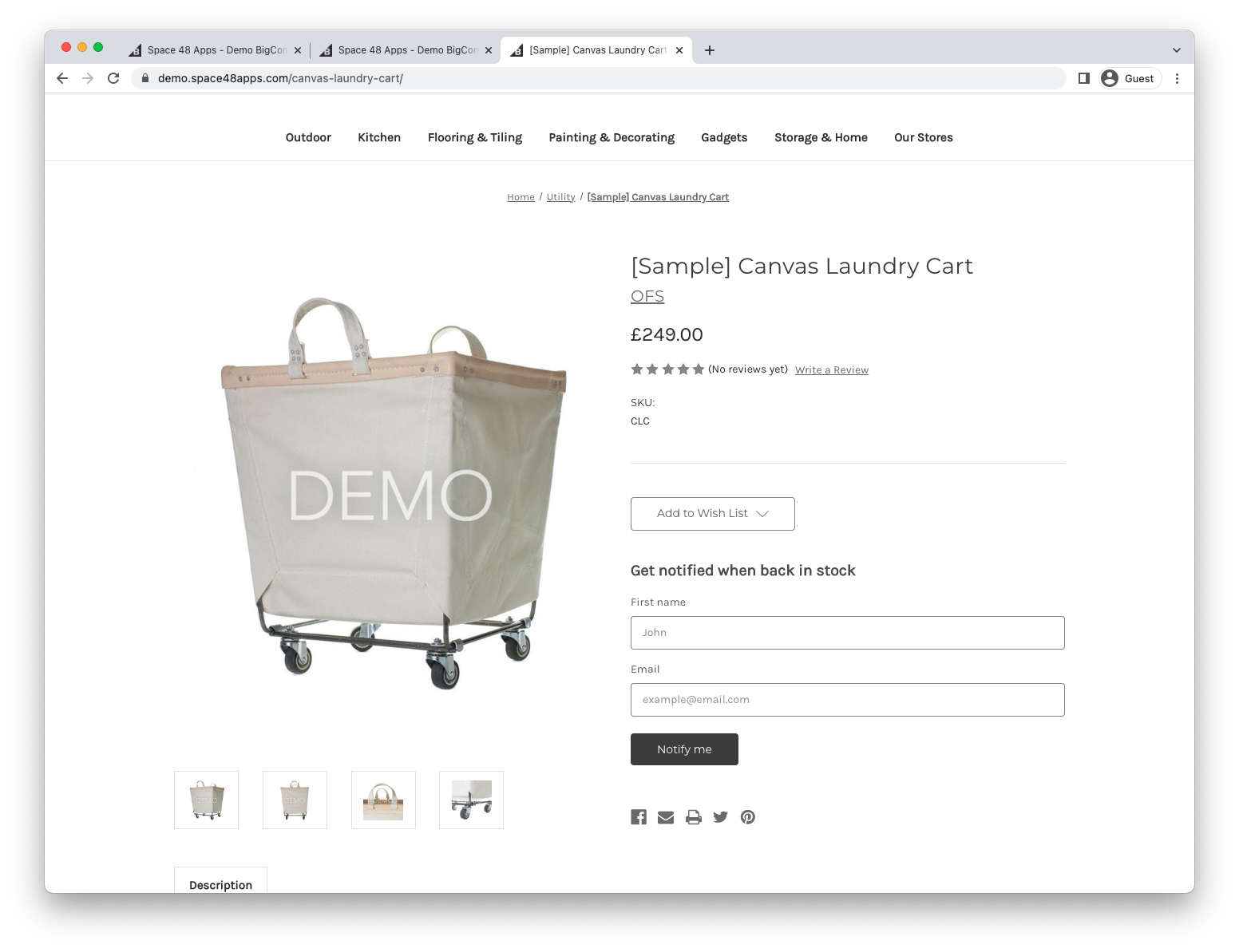
Disable the option to display the form directly on the product page.
The form also works in Quick View for out-of-stock products.
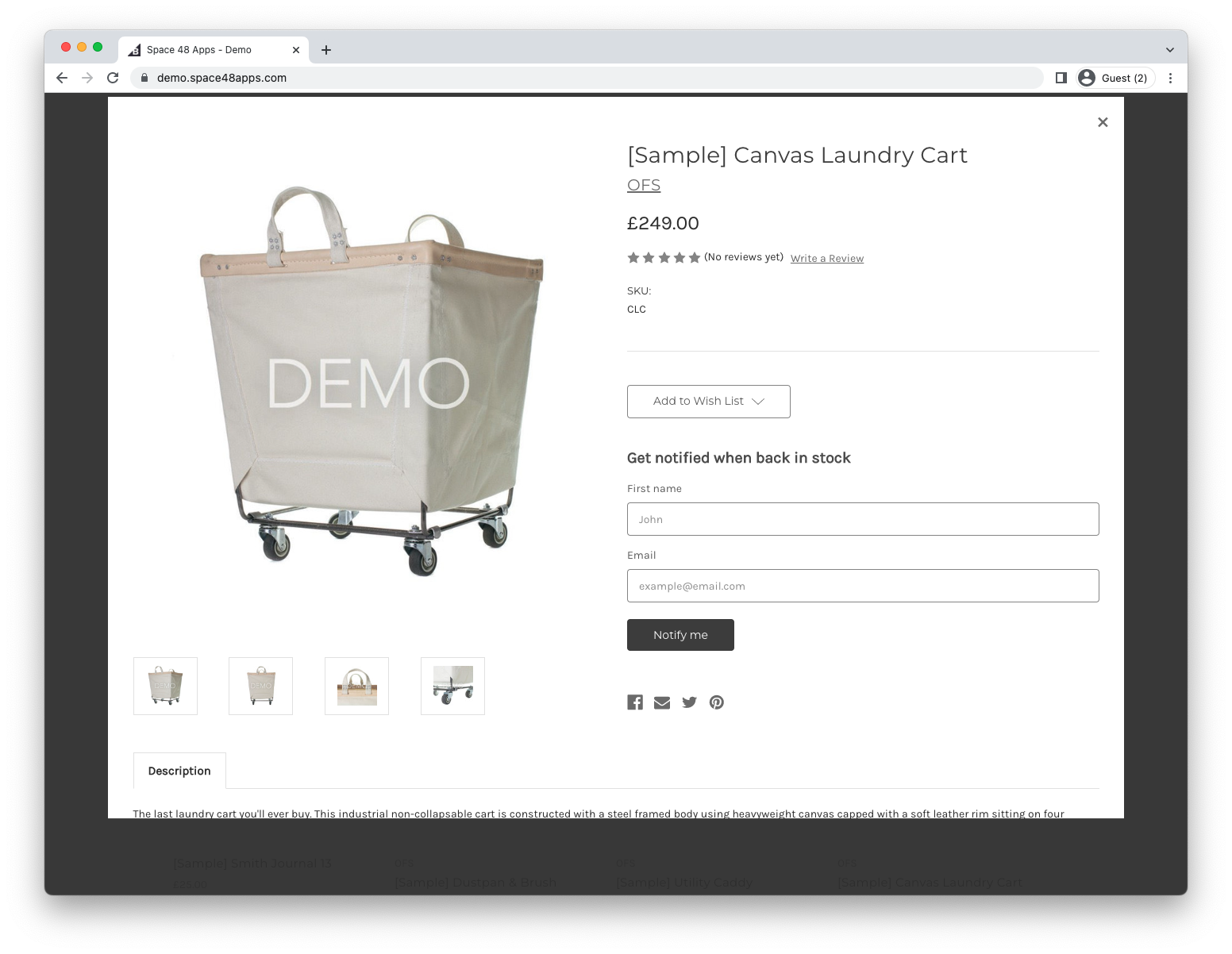
Replace the add-to-cart button
By default, the alert button or form appears below the add-to-cart button. Enable Replace the add to cart button to hide the original button and use that position for the alert experience.
Some themes, including Cornerstone, hide the add-to-cart button when a product is out of stock. If the replacement option has no visible effect, your theme may need a template change so the original button remains in the page markup.
Collect customer details
Choose whether to collect a first name, or both first and last names.
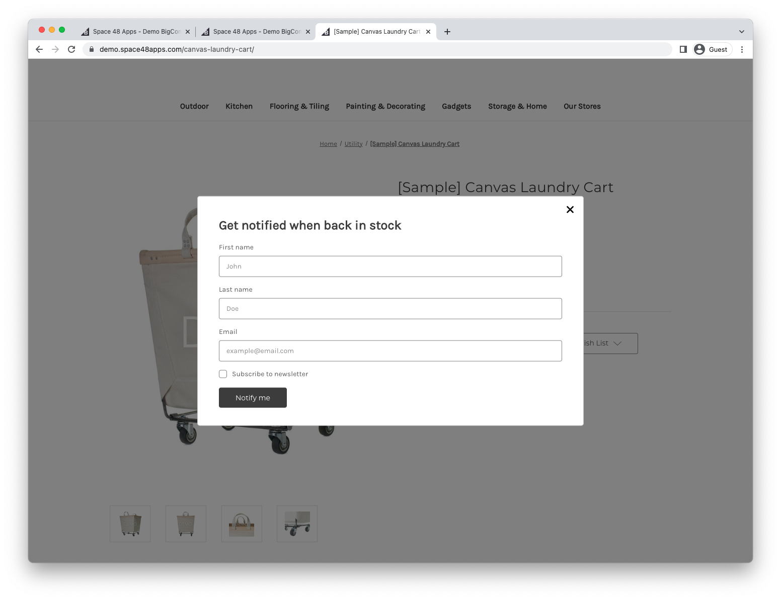
Enable newsletter sign-up to ask for separate marketing consent. When a customer opts in, the app updates the BigCommerce newsletter-subscriber list. You can also export consented customers.
The other Form design fields control the customer-facing copy:
- Newsletter label: text shown beside the newsletter consent option.
- Button label: text on the button that submits the alert request.
- Privacy text: optional privacy or consent copy shown near the form.
- Success message: text shown after an alert request is created.
- Already subscribed message: text shown when the customer already has an alert for the product.
- Select product options hint: guidance shown when the customer needs to choose options such as size or colour first.
Change the text and button style
Use the Form design section to edit customer-facing text.
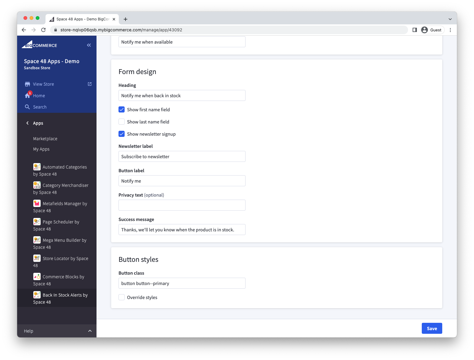
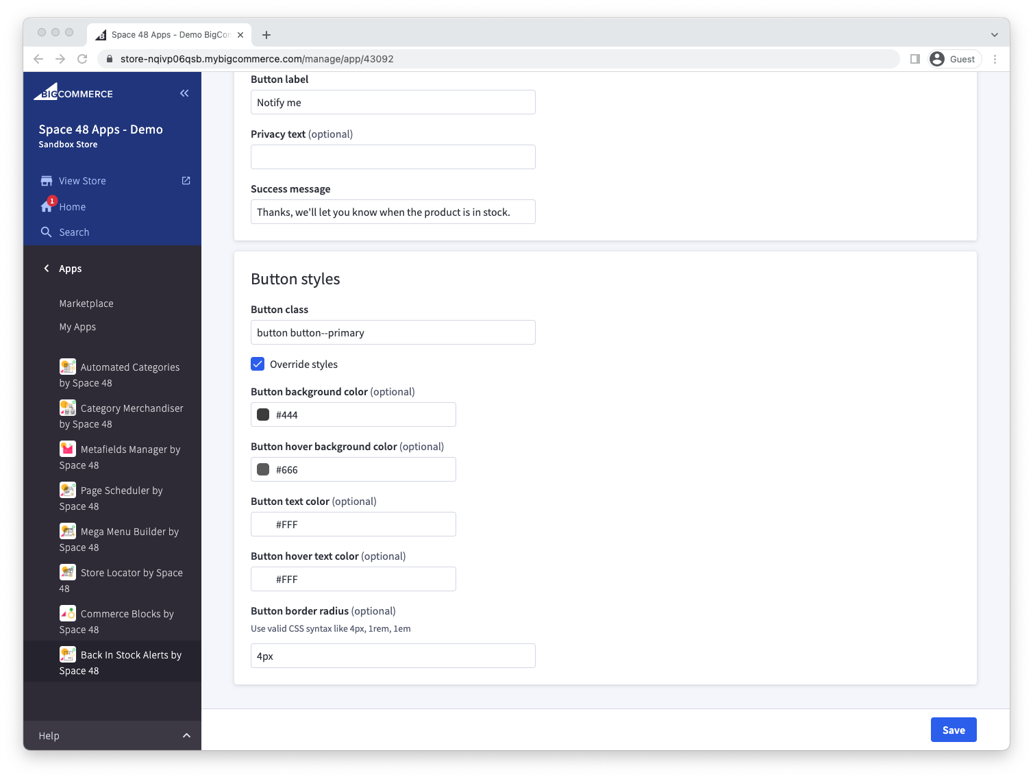
To match your theme, set the button class to an existing theme class. Cornerstone uses button button--primary by default. You can instead enable style overrides and set custom colours and border radius values.
The Button class field accepts CSS classes already used by your storefront theme. If you enable Override styles, use valid CSS values such as 4px, 1rem or 1em for the border radius.
Exclude products
Enter a comma-separated list of product SKUs where the sign-up form should remain hidden.
For a heavily customised theme, see Advanced sign-up form customisation.